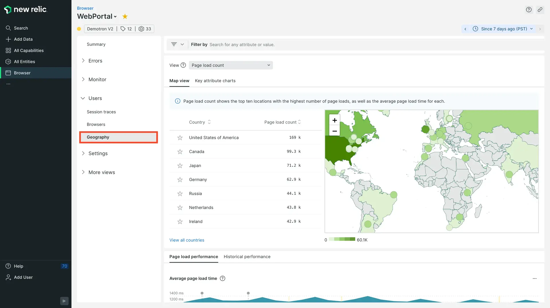
With New Relic , the Geography UI page provides a world view with color-coded performance information about your frontend experience in cities, regions, and countries anywhere around the world. The map shows your user data by region, so you can visualize your traffic and error hotspots alongside device type information. You can also examine critical Core Web Vitals data so that you can prioritize areas around the globe needing attention.
If you work in IT or operations, this level of visual detail is especially useful for making business decisions about peering agreements and CDN usage. For example, if it's unclear which regions are experiencing higher page load times than normal, our Geography UI can help you track down the root of the problem.
For some tips on how to make the most of the available data, see the filter examples.
Troubleshoot performance location
Depending on the type of performance or usage data you select, the list next to the map shows either the top best or top worst. For example:
- With page load count and unique session count, the top of the list is the best performing.
- With average page rendering time and largest contentful paint, the top of the list is the worst performing.

one.newrelic.com > All capabilities > Browser > (select an app) > Geography: Get detailed information about network performance and end users' experience anywhere around the world.
To view or sort your browser monitoring performance data by location:
- Go to one.newrelic.com > All capabilities > Browser > (select an app) > Geography.
- Use the dropdown to select the type of performance or usage data you want to view, such as page load or unique session count, average time for various processes, largest contentful paint, interaction to next paint, cumulative layout shift, etc.
- To drill down to a specific area, mouse over or select any area on the geographical map, or select any of the locations on the list.
- To view specific performance data, filter any attributes below the funnel icon.
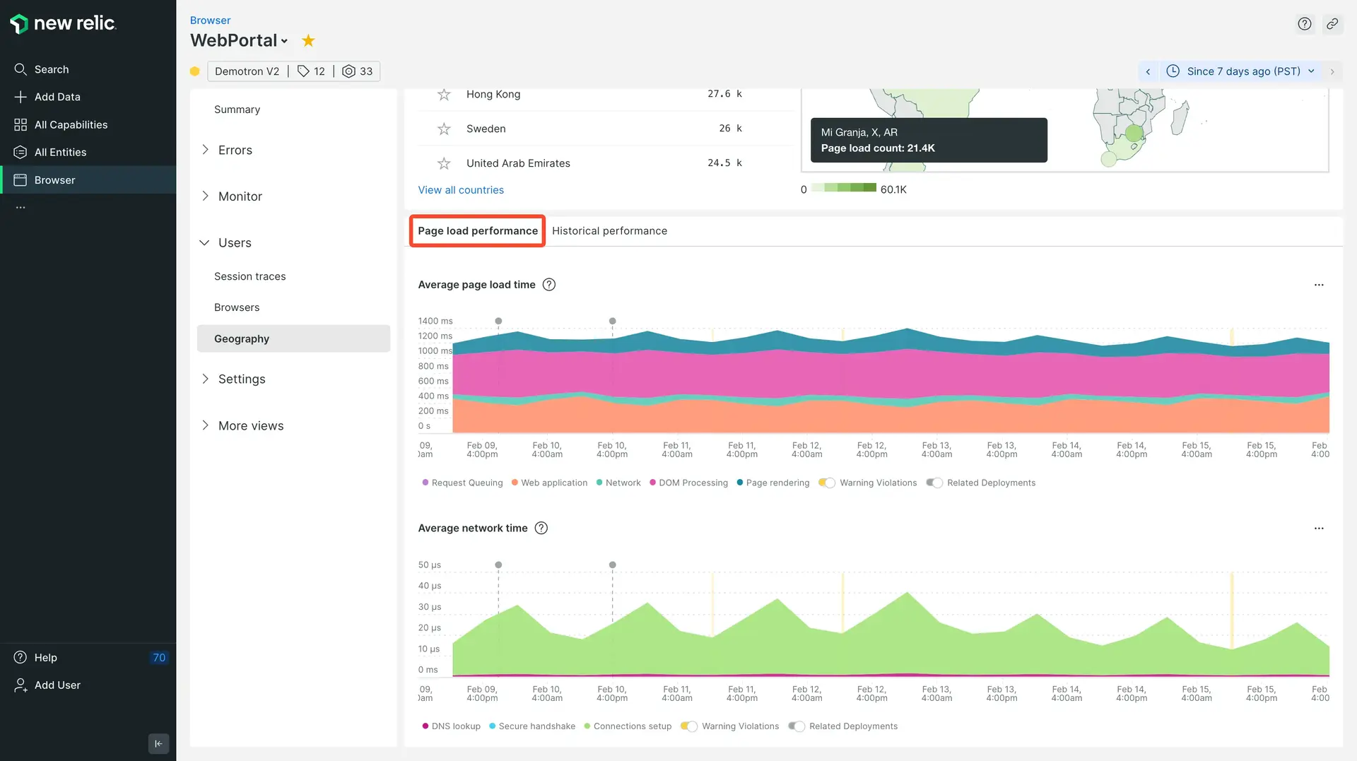
- To compare page load and network performance with historical data, review the charts below the map on the Map view and Key attribute charts tabs.
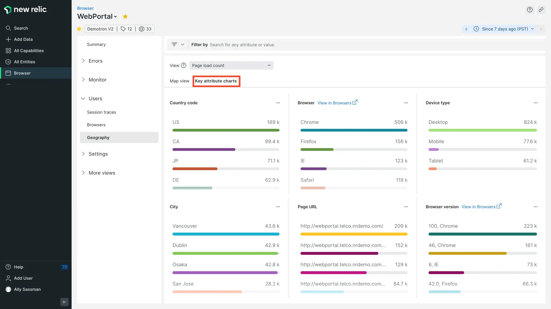
- To view additional charts of your data, click the Key attribute charts tab.

one.newrelic.com > All capabilities > Browser > (select an app) > Geography: The charts on the Map view and Key attribute charts tabs provide additional details about page load and network performance over time.
Charts on the Key attribute charts tab automatically refresh with comparative performance details for the selected location. These charts provide insights into performance issues related to specific locations, browsers, devices, URLs, or browser versions.
Filter performance data
You can filter and group data by attributes in various categories; for example:
- Webpage performance (page load time, throughput, network time, secure connection time, etc.)
- Core Web Vitals (first paint, first contentful paint, etc.)
- Users' operating systems, browser names or types, browser versions, device types
- Network performance (ASN via IP mapping and ISPs, SSL negotiation timing, DNS timing, time to first byte, etc.)
To see the list of available attributes, click the funnel icon.

one.newrelic.com > All capabilities > Browser > (select an app) > Geography > Key attributes charts: Here is an example of charts that have been filtered so you can examine network performance by ASN organizations.
The filtered results appear on both the geographical map and the key attribute charts. This makes it easy for you to use any of the standard map functions and filters to explore additional details. Here are some examples.
Factors affecting collected data
To ensure end user security, the agent collects GeoIP information for the end user's ISP. The agent does not collect GeoIP information for the specific end user. For example, if an end user in Portland, Oregon uses an ISP located in Beaverton, Oregon, the GeoIP information would show their location as Beaverton.
To capture page load timing information, the browser monitoring agent uses the Navigation Timing API, which most (but not all) browsers support. If the browsers do not support the Navigation Timing API, then the UI charts and data points can only show the network data they receive for DNS lookup, connection, secure handshake, etc. This may not be 100% of the app's overall traffic.
Also, firewalls may have an impact on the geographical data collected about your end users.