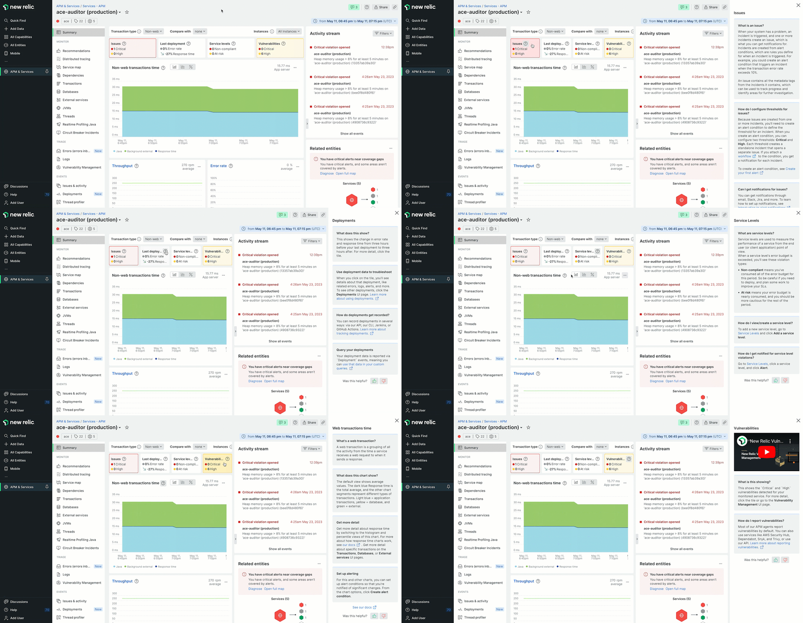
Our in-product help content provides users with the tools they need to understand the New Relic UI, interpret performance data, and learn how our solutions can help with their problems. Onramps provide more detail than a tooltip. Ideally, they give users essential info so they can stay in the product and keep working, rather than switching over to read the docs.

Content guidelines
Great onramps content should:
- Be clear and concise. Avoid using jargon or technical terms that users may not understand.
- Be written in second-person point of view to address the reader. Address the user as
you, such asWe couldn't find your data. - Answer the
whyandhowquestions. For example, a user might ask themselves,Why is this important?orHow can this information help improve an app's performance?Write content to help users answer these questions to understand the larger context of their application. For example, a user can learn about how APM and logs relate to each other, or how APM and infrastructure relate to each other. - Provide additional context to clarify ambiguous or confusing areas in the product. For example, something is not clearly defined in the UI, we can provide additional information to help users understand it. NOTE: this should be a rare edge case. The better solution when something isn't clear in the UI is to work with the team that owns it, their Product Designer, and the Content Design team to improve the UI.
- Help users get more out of New Relic. Help users get the most out of New Relic. When users are able to use New Relic effectively, they are more likely to continue using our product and recommend us to others. Include information that helps users:
- Understand what a feature is used for, and the benefits of the feature beyond the existing heading or other content.
- Perform specific tasks.
- Understand what to do next. Are there recommended follow-on actions? For example, the Apdex troubleshooting onramp provides a nice example of this. It tells users to
Compare the Apdex chart with other charts (like web transaction time and error rate) to look for the causes for the Apdex change.
Category | Guideline |
|---|---|
Onramps usage | Not every section of the UI requires an onramp. Use them primarily at a high level on the page. If the design calls for an onramp in a spot where you don't have much to say, then talk to the designer (Product and Content) and PM for the section about modifying the design or removing the onramp. If the onramps content isn't in the main place where the feature is (for example, onramps content for the Service levels tile is on the APM Summary page), avoid adding too much detail. |
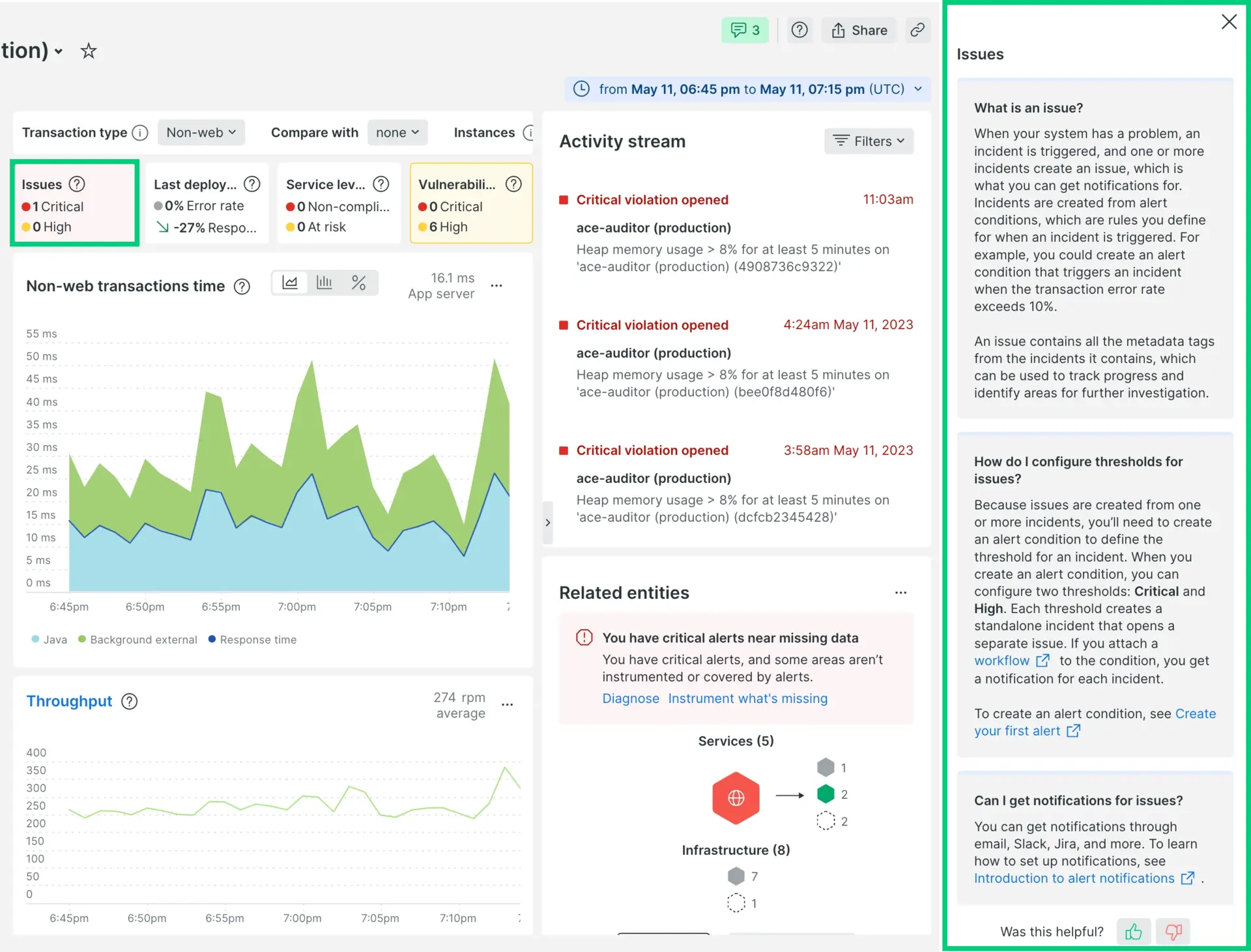
Headers | Headers can be any format, as long as they're short/succinct. For example, you can use an FAQ format where the headers are in question format. Just make sure to avoid using first-person pronouns; use "you/your" for users. Here's the Issues tile onramp with titles formatted into questions.  If FAQ format is not applicable, use our standard headers for titles. |
Content length | If you're not using collapsers, try to keep the character count under 1200 for the entire onramps section. |
Bold/italics | Since we can't add code formatting to onramps content, use bold and italics to emphasize something as needed. |
UI navigation | It's okay to add a link to docs for more details on something, just keep the following in mind:
|