In New Relic Mobile, you can use our dashboard capability to gather and chart the specific data you want to see. Any dashboards created in the New Relic website will be visible in the mobile app.
You can use our mobile dashboards to:
- Drive insight with custom, high-density interactive visualizations with a consistent UI.
- Chart all the events and attributes from everywhere across our platform.
- Add custom attributes or send custom event types to most events in order to better understand your business, and see specific details about how your customers interact with your platform, such as page views, host transactions, etc.
- Explore and contextualize data with advanced tooltips and zoom functions to monitor what your systems are doing in real time.
- Search your dashboards for attributes and metrics.
- Report custom data to New Relic and your dashboards from any source.
Getting started with Dashboards
- Log into your New Relic Mobile app and tap Dashboards.
- For each dashboard, the index displays the following information:
- Favorite status, indicated by a star.
- Name: The name of the dashboard.
Dashboard permissions
Dashboards have three types of permissions:
- Edit: everyone in account: All users have full rights to the dashboard.
- Read-only: everyone in account: All users are able to see the dashboard, but only you've full rights to work with the dashboard. Other users can access the dashboard but are not able to edit or delete it, although they can duplicate it.
- Private: Only you can see the dashboard. Everything but the metadata is hidden.
To edit permissions, please see our User management docs.
Filter and refine your charts
You can narrow down the information on display using the filtering function, which is a visual representation of query conditions. On any dashboard, tap the Filter by any attribute or value link at the top.
- Use the filter bar to select the values or attributes you want to see, and remove the rest of the elements from the charts.
- Open the advanced filter bar to access the boolean operators (such as
=,!=,CONTAINS, andEXCLUDES) and add compound and complex conditions for filtering data. - After applying a filter, your dashboard will only show the data associated to the elements you selected. A small counter indicates the number of filters applied at a time.
To return to the default view, tap on the “X” by the filter at the top to remove it.
Filter using the chart legend
Tap on a legend in any chart with legends to see that series only, and remove the rest of the series from the chart. This helps you isolate the data you want to analyze.
Adjust time settings
By default, each chart in the dashboard shows data for the time period specified when they were created in the query builder. However, you can use the time picker to change the time range of the data on display and set the same range for all charts. This is particularly useful while troubleshooting alert events, if you need to narrow down your data to observe what happened in a specific time period.
To change the time range:
- Tap the clock icon at the top right of your dashboard
- Choose one of the available options from the menu by tapping radio button
- Or you can customize the time range with specific start and end timestamps using the custom menu.
Share your data
- In your dashboard, tap the Share icon in the top right
- Use your device's share sheet to send your dashboard link
Data Scrubber
The chart scrubber helps you select a data point or facet in a chart when the chart is too crowded and facets are too close to each other.
Move your finger along the needle to smoothly select the adjacent facets and view their associated data points. You can also lighten a heavily populated chart by unselecting one or more of the attributes that appear in the UI.
Template variables: dynamically filter dashboards
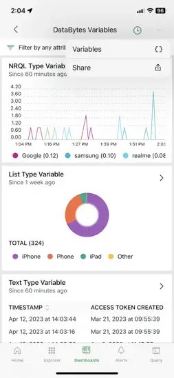
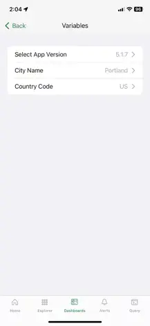
In New Relic dashboards, template variables are placeholders in the NRQL queries that can be later assigned a value, which allows for more flexibility when handling different use cases. Once you create dashboards with these variables in New Relic on the web, you can then view them in New Relic Mobile, allowing you to easily filter through your dashboard for more precise data insights.
For more information on creating template variables on the web, read our Dashboard docs.
After you create your dashboard on the web, you can see that same dashboard and filter by those same variables in the mobile app:

New Relic dashboards on the web.


New Relic dashboards for mobile can be filtered by the same variables as on the web.