Queries help you find the information you need, and the charts and graphs based on those queries make the data useful to your organization. Charts and dashboards provide the foundation of data visualization, giving you multiple options that enable you to create visually appealing and easily understandable data streams. You can make the most of your data by understanding the ways that NRQL queries lead in to charts and dashboards.
Charts

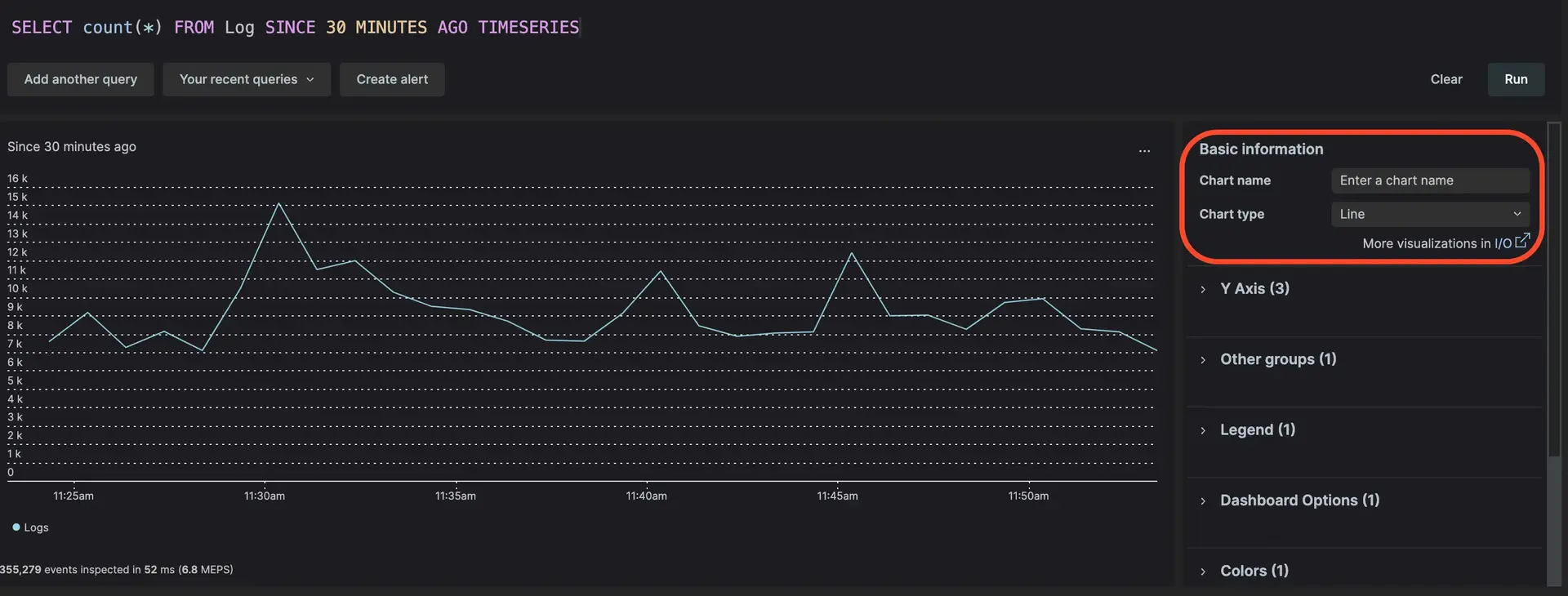
Creating a chart from the query builder before saving a NRQL query.
To complete writing a NRQL query, you must create a chart as the final step. New Relic offers multiple ways to visualize your data, and you can do alot with your charts once you've made them. After you write your NRQL query, you can:
- Use your chart as the start of a new dashboard to monitor multiple NRQL queries from a single location.
- Add your chart to an existing dashboard to add another NRQL query to your monitoring.
- Share your chart with others by copying the permalink or downloading it as a PDF (or CSV, if applicable) to enable others to see data from your queries.
- Edit the NRQL query behind the chart to help fine-tune the data you're seeing.
- Create an alert from your NRQL query to help proactively notify you when problems arise.
Charts are great on their own, but they really shine when you compile them together to create dashboards, which you can learn more about in the sections below.
Dashboards

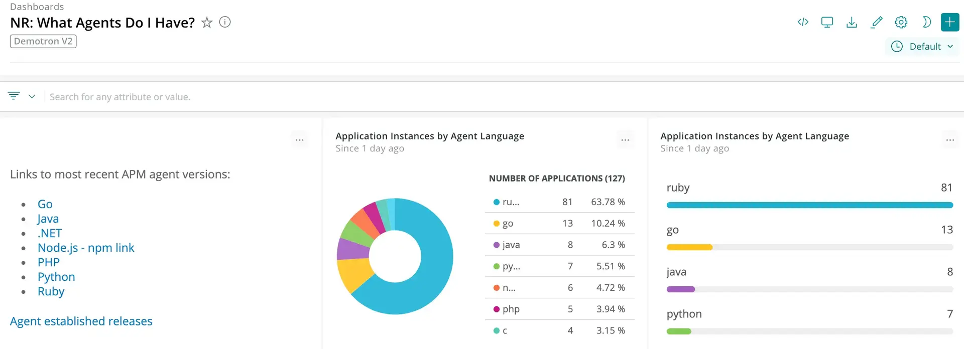
A dashboard representing data in pie and bar chart formats.
While charts are great for reporting on individual pieces, dashboards are the best way to get a much broader view of your data: if charts are pieces to a puzzle, dashboards are the puzzle completed. Dashboards are highly configurable, and you can use them to show any number of streams you like. You can:
- Add charts to your dashboards using the query builder.
- Add your own text, images, or links (using Markdown) to your dashboard.
- Move charts around within a dashboard to make sure the most important data is where you want it to be.
- Share your dashboard by email or create a permalink to your dashboard.
- Import or export your dashboard as a JSON, or export your dashboard as a PDF.
- Duplicate the dashboard to use as a foundation for an entirely new one.
- Edit your dashboard components to add new data streams, modify existing ones, or remove older ones that are no longer relevant.
Have you seen our intro to NRQL and learned how to use NRQL? If you have, you're ready to start our guided NRQL tutorial!
Tips to improve dashboard and chart performance
If your New Relic charts on dashboards are not performing optimally, consider the following tips to enhance performance:
- Use Table visualization: For displaying large datasets, use the table visualization rather than bar or billboard visualizations.
- Separate visualizations: Distribute your visualizations across multiple pages. A dashboard with numerous visualizations on a single page can cause performance issues, particularly if some charts are frequently updating or processing large datasets.
- Split NRQL queries: Divide large NRQL queries into smaller, more manageable queries.
- Limit query results: As a last resort, avoid using
LIMIT MAX. Instead, specify a limit that meets your requirements.